

Product strategy and design: prove it before you polish it
Three made-up stories about testing an idea, fixing a confusing experience and planning what comes next. Not client projects.
4 min readMade-up stories, not client work
Story 1 of 3
Testing an idea before building it
The short version: Test the idea with real people before paying to build it.
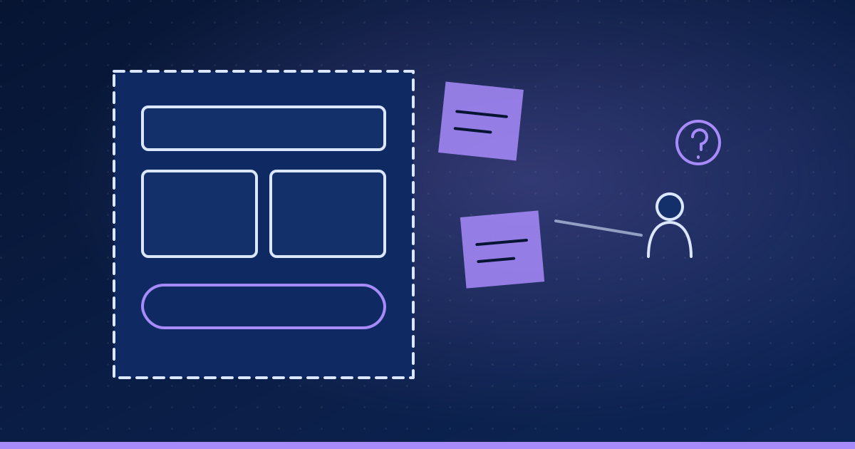
A company that trains restaurant staff wants a learning app. Leadership is excited and ready to fund a full build.
What's going wrong
Nobody has checked whether busy managers would actually use it, or what they'd use it for.
What we'd do
- Talk to the people who'd use itShort conversations with managers and staff about how training really happens today.
- Sketch the core ideaA clickable mockup of just three screens, made in days, not months.
- Watch five people try itSmall tests reveal most of the confusing parts before a line of code exists.
- Check real interestA simple page describing the app, to see whether people sign up for early access.
How we'd know it worked
- Managers can explain in their own words why they'd use it
- Testers complete the main task without help
- Enough sign-ups to justify building a first version
- The catch
- A few weeks of testing feels slower than diving in. It's far cheaper than building the wrong app.
- What the business gets
- A go, no-go or change-course decision based on evidence, before the big money is spent.
Story 2 of 3
Fixing the screen where customers give up
The short version: Fix the step where people give up before redesigning everything.
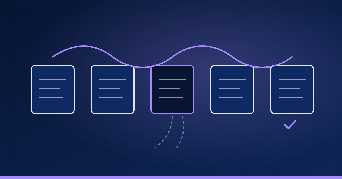
An online insurance quote form gets plenty of visitors, but few finish it. The first instinct is a complete redesign.
What's going wrong
A redesign is expensive and might not touch the real reason people leave.
What we'd do
- Find where people drop offThe analytics show most leave at one step: a long page of questions.
- Watch them struggleUsability sessions reveal confusing wording and questions people can't answer without paperwork.
- Fix the biggest snag firstPlain words, fewer questions up front, and a way to save and come back later.
- Compare old and newWith enough visitors, half see the old form and half the new one, so the result is clear.
How we'd know it worked
- More people finish the form with the new version
- No drop in quote accuracy
- Support questions about the form go down
- The catch
- Small, targeted fixes look less impressive than a shiny redesign. They're quicker, cheaper and easier to measure.
- What the business gets
- More finished quotes from the same visitors, without rebuilding what already works.
Story 3 of 3
A roadmap and a design system for a growing product
The short version: Say no to most requests, so the product stays easy to use.

A software product has grown fast. Every customer request becomes a feature, and each new screen looks a little different.
What's going wrong
The product is getting harder to use and slower to build, and the team can't say what matters most next.
What we'd do
- Sort the requestsGroup feature requests by the problem behind them and how many customers share it.
- Build a simple roadmapNow, next and later, tied to business goals, and reviewed every quarter.
- Create a design systemA shared kit of buttons, forms and layouts, so new screens look and behave the same.
- Measure what changesProduct analytics show whether new features get used, and feed the next roadmap review.
How we'd know it worked
- Every roadmap item linked to a goal and real customer demand
- New screens built from the shared kit
- Unused features reviewed, and removed if they're not earning their place
- The catch
- Saying no, or not yet, to some customers is uncomfortable. A focused product serves most of them better.
- What the business gets
- A product that stays easy to use as it grows, and a team that builds what matters.
What all 3 stories have in common
Watch real people first. Design for the job they're doing. Prove it before you polish it.
Good design isn't decoration. It's what makes a product easy enough that people keep using it, and that starts with watching them, not with picking colors.
- 1
Start with people
Who they are, what they're trying to get done, and where they get stuck today.
- 2
Test cheaply
Sketches and clickable mockups before anything is built.
- 3
Let evidence decide
What people do counts for more than what anyone in the room assumes.
- 4
Keep it simple
Every extra button is something else to learn, build and maintain.
Design decisions are business decisions. We make them with real people, small tests and clear goals, before the expensive part starts.
If you liked this, read
About these stories. These stories are made up to show how we think. They are not client projects, describe no real business, and contain no measured results.
Next: Marketing that pays its way: know the customer, measure everything
Three made-up stories about leads, search and follow-up, showing how we decide where marketing money goes. Not client projects.
Read the next story